The biggest population decline in Chicago's history began in 1970. In the next ten years, according to Census data, the city lost over 360,000 residents, ending that low decade a hair over three million. From 1950 to the present, the city lost almost exactly 900,000 people.
Much has been said about the patterns that exodus created. The renewal of downtown and the population decline in south and west-side neighborhoods created what Daniel Kay Hertz calls an income donut, a small area growing in wealth and space from downtown out to the South Loop and nearish-north-side, surrounded by growing stretches of poor neighborhoods out to the city limits and even beyond, and finally a ring of wealthy outer suburbs.
What happened to the neighborhoods in that donut? New data from the City Observatory is suggestive of how the distribution of poverty changed in Chicago as its population declined.
There are many, many more high-poverty tracts in Chicago and its central suburbs. (The data is for the metro area, but only for census tracts within ten miles of the central business district, so it's a helpful look at the donut Hertz is talking about.)
But the population in the chronically high-poverty neighborhoods has completely collapsed. Those 48 census tracts, which all had poverty rates north of 30 percent in both 1970 and 2010, lost over 70,000 people.
Meanwhile, in the rebounding neighborhoods—from 30 percent or more to 15 percent or less, there were very few impoverished residents to begin with, just 17,000, which fell to about 3,500.
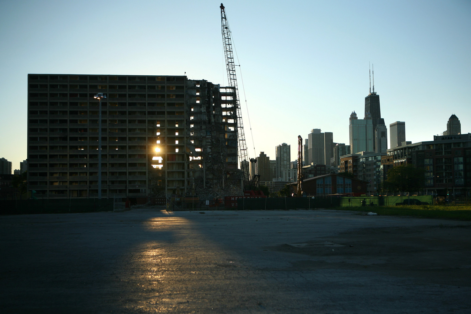
There's some evolution that the data doesn't seem to be catching. In the map, note the pocket of chronic poverty on the near-north side, immediately next to rebounding tracts. That's where Cabrini-Green was; it's almost certain to be rebounding in the next round of data.
Otherwise, the patterns are familiar. There's a beachhead of gentrification slowly pushing out from downtown and a belt of newly-poor neighborhoods, with more people living in poverty, forming an almost-contiguous ring on the south and west sides of the city. And there are still neighborhoods of chronic poverty—but many fewer people living in them. It's reminiscent of patterns seen nationwide with housing voucher recipients, who tend to move from very poor neighborhoods into less-poor but still poor neighborhoods:
Research examining neighborhood poverty outcomes for subsidized households concludes that public housing tenants live in particularly high poverty neighborhoods, and voucher households—whether they be participants in demonstration programs or the general voucher- holding population—live in a wider array of neighborhoods that also have relatively high poverty rates.
The City Observatory's research is an interesting perspective on the dynamics of poverty in the city—how it has moved within that income donut as population has declined. A handful of neighborhoods have moved out of poverty, but the donut continues to grown, in ripples, through the city.


