Hopewell Side Salad
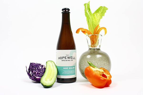
An almost-aggressive minimalism is softened by a color palette of sandy taupe and baby blue. It’s the countryside farmhouse of beer labels; stark and assertive in its simplicity, down-home. Slap this label on any storefront two-flat and guaranteed something artisanal will emerge from within. Downside: The company’s namesake “H” with its curly tail provides an awkward curtain to the front-window font that reads more like an old-school soda fountain. Its flounce distracts from the label’s charm.
Solemn Oath / Night Shift Brewing Hosies
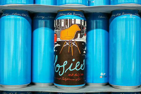
A tribute to dibs throws a curveball with the addition of a modern chair holding down the shoveled spot. With a row of two-flats in the background, there’s a lot to love architecturally in this label.
Moody Tongue Applewood
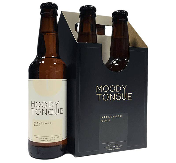
Moody Tongue provides an antidote to the psychedelic tendencies of everyday craft beer. It reminds us that, no, not every day is a Phish concert. An intro to modernism: In contrast to the principles of classical forms like giant Romanesque pillars and ornamented brickwork, modern design values simple, clean forms. Though they’re meant to be easily reproduced for mass-consumption, these forms don’t lack gorgeousness of line, volume, and an identity. It’s a perfect choice for a beer label—easy to recognize and unfussy.
Maplewood Pulaski
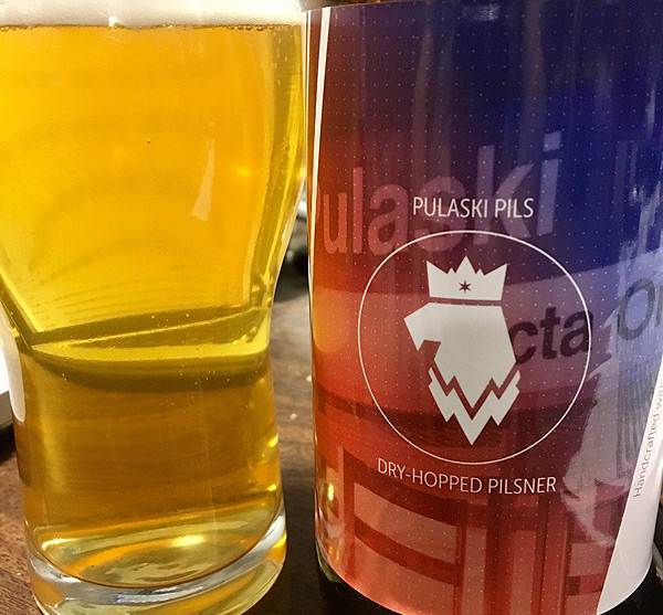
A multi-referential label that calls out to Chicago’s celebrated war hero, Casimir Pulaski, but also reminds drinkers of how his legacy is celebrated in the city’s urban fabric. The easily-recognizable CTA font—the modernist classic Helvetica—in Red Line red serves as the background in a matte photo, while the brewery’s custom icon sits atop. Those icons are unique for each Maplewood beer, a stripped-down moniker of shapes and negative volumes. Pulaski’s logo, here, is the white eagle on Poland’s state insignia. Its crown bears a Chicago star. Maybe a little too obvious, but it makes for a beer label that looks and feels like Chicago.
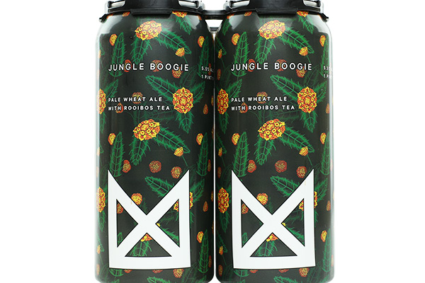
Marz Jungle Boogie
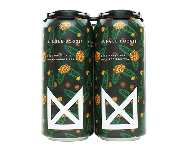
With Marz Brewing’s new taproom in Bridgeport having just opened, it’s worth the time to admire their chic cans. Jungle Boogie is a clear stand-out among the bunch: straightforward, plant-themed and using pops of color for texture and ornamentation, creating the illusion of depth. It’s not the heart of darkness jungle, sure, but just image how chaotic this can could have turned out. The logo, though—oof. Maybe size it down a bit—this city has too much trauma from “yuge” labels on pretty things.