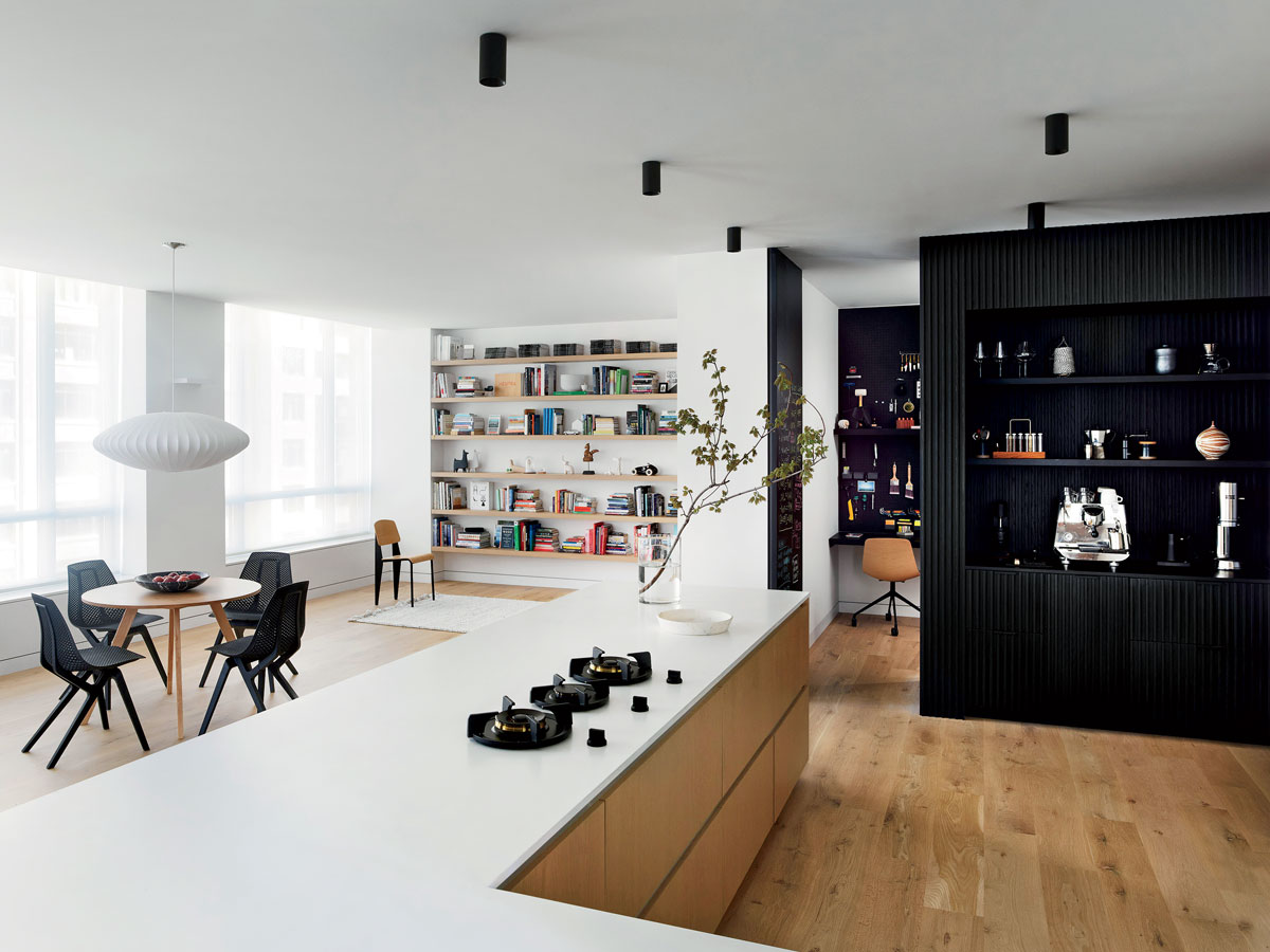
Less is more can be a bore without an eye for light and texture. In reworking a 1,600-square-foot, three-bedroom South Loop condo into a one-bedroom unit with an open floor plan for a client, architect Eric Rothfeder skillfully employed black and white as drivers in the redesign. Here he reveals how even a limited palette can make a strong visual impact.

1. DRESS YOUR CEILING
“A more sculptural fixture becomes a design object itself.”
2. MIX AND MATCH
“Differences in texture, sheen, and detail, like with this table and chairs, create variation.”
3. LET YOUR TREASURES SING
“The restrained palette works as a neutral backdrop for all of the objects we use and love.”
4. GO DEEP
“Black is more interesting when it has some depth. This coffee bar is made from ebonized oak slats with a very dark black stain.”
5. EMBRACE CONTRAST
“Plain-sawn white oak flooring pairs beautifully with black and white finishes throughout the room.”


