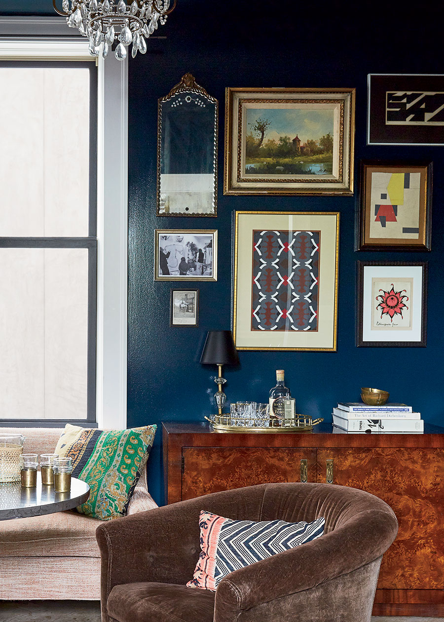
The Study
“Different sizes and shapes are important because you need density and negative space. You also need texture and color. We do a lot of sourcing through antique and vintage stores for great art that isn’t expensive. And then pepper in personal photos. I often say to clients: ‘Pull all the photos that are weird, the ones that are not good pictures in your opinion — the one where you’re looking off into the distance or your husband isn’t looking at the camera. Those are worthy of being hung on a wall rather than on a shelf in your office.’ ”
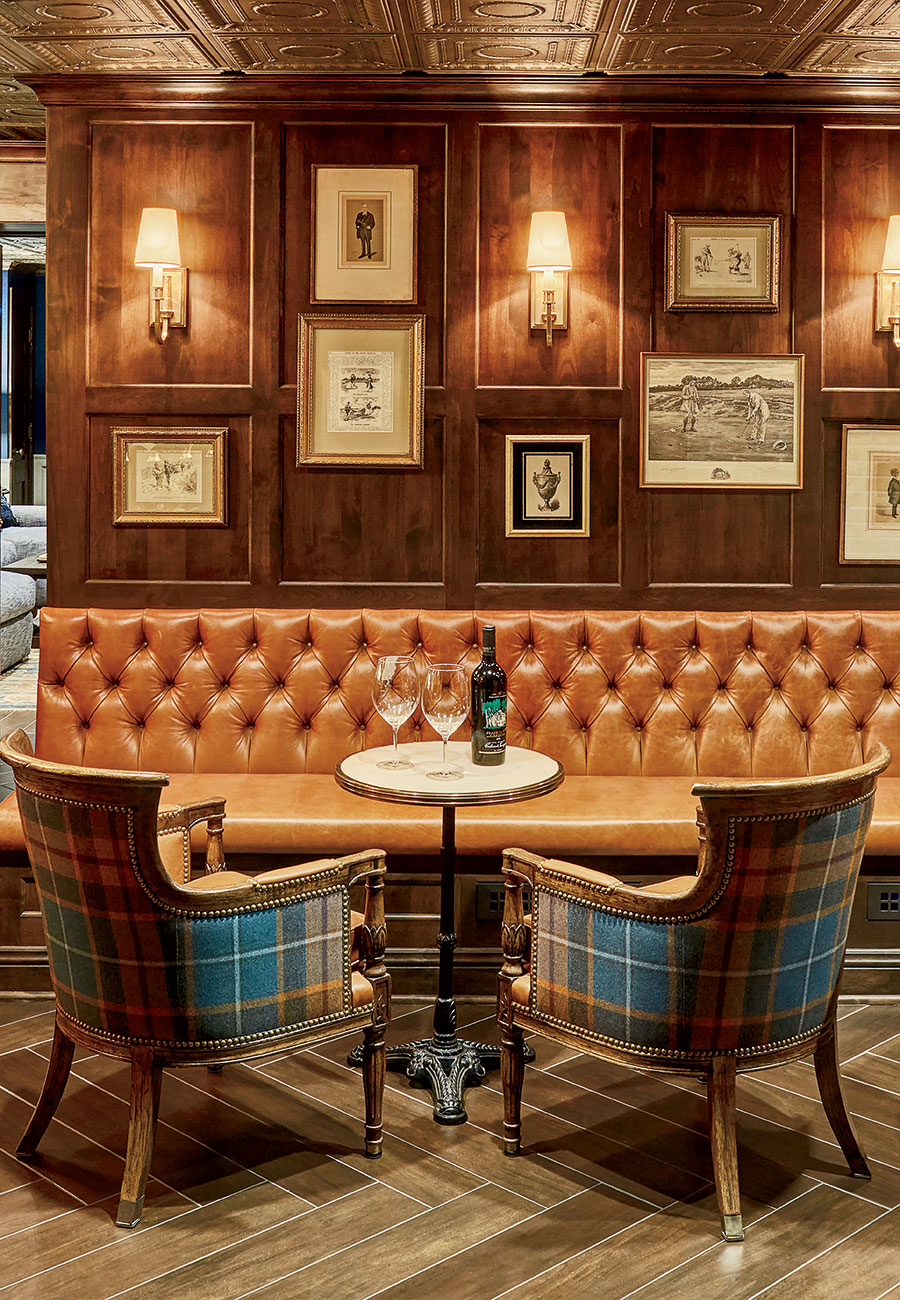
The Lounge
“We were trying to create the vibe of an English pub. So I love this offset grid, where the artworks don’t quite line up. That’s what English pubs would do — hang things willy-nilly, without thinking about it. If you don’t like it, you move a piece and try it again. It’s trial and error. But that’s what makes it fun.”
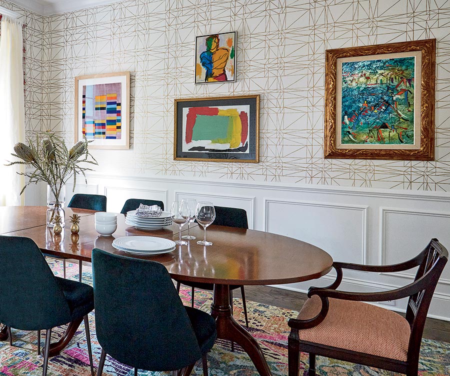
The Dining Room
“What you don’t want is for it to look like a dentist’s office. Everything can’t be the same. Here, one of the pieces is very minimal; another is more dense. By putting them next to each other, it makes both more interesting. I prefer a mix of frames: black and brass and silver leaf. I love old frames that are a little beat up, that look collected or inherited. If the piece is modern, have it framed in a traditional frame, because it’ll look like out of a museum.”
Comments are closed.