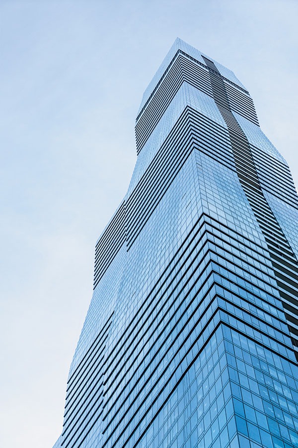
For my money, the view west from the DuSable Bridge at Michigan and Wacker has always been one of the most exciting in Chicago. A century’s worth of tall buildings spring from the banks of the Chicago River along Wacker: the LondonHouse Chicago, with its curved limestone façade; the new towers at Wolf Point; and, in between, a murderers’ row of fine high-rises, including the midcentury icon Marina City. By comparison, the view to the east has always struck me — with the exception of Harry Weese’s silvery, blade-like Swissôtel Chicago — as architecturally meager.
But not anymore.
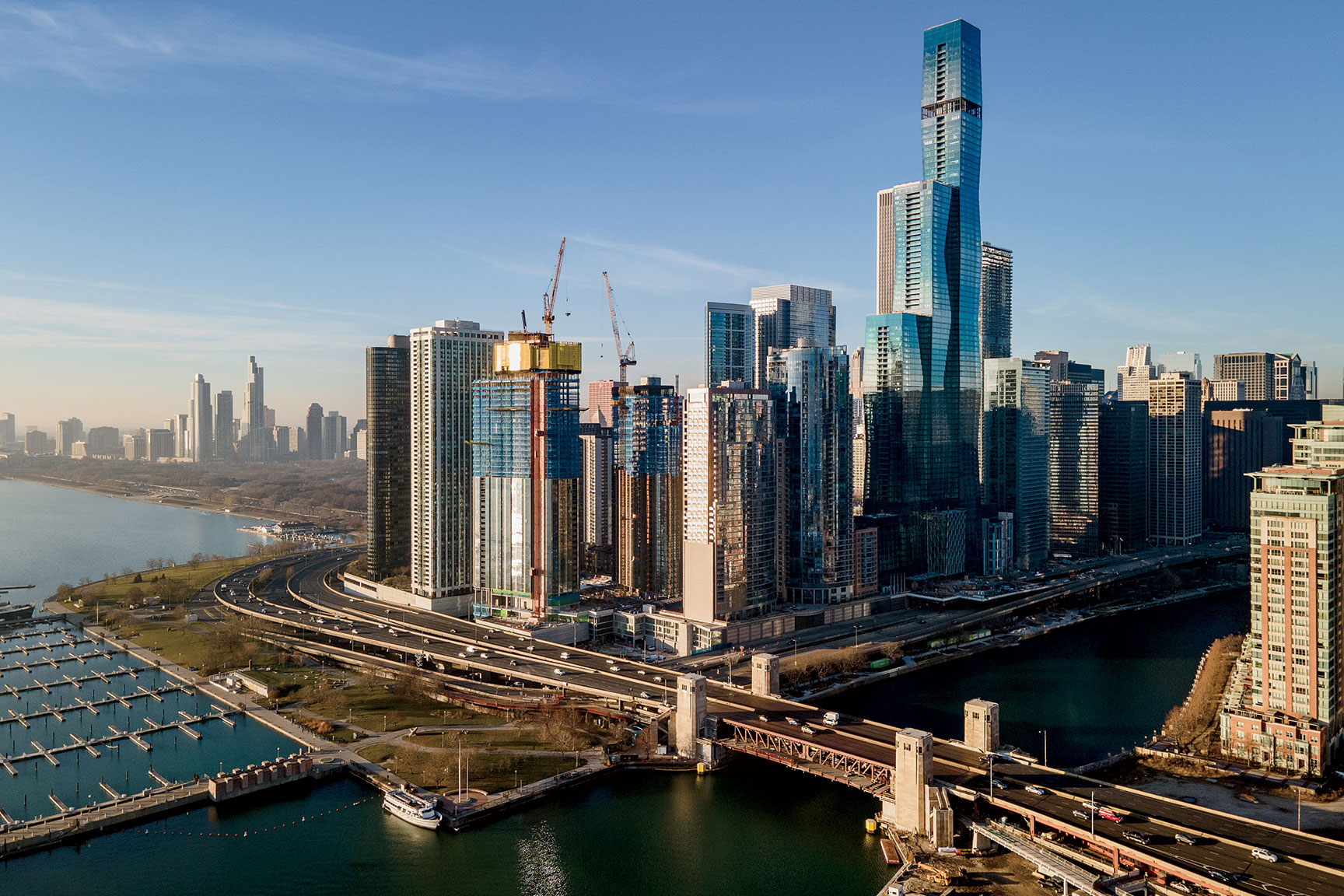
With major construction now all but complete, Jeanne Gang’s 101-story St. Regis Chicago, at 363 East Wacker Drive, has fundamentally shifted our vaunted skyline’s center of gravity. The undulating profile of the trio of towers — the westernmost one attaining 1,191 feet, making the St. Regis the city’s third-tallest building (and the country’s 10th tallest) — takes on the tones of sky and water in a bewitching play of light and color. Gaze at the building a bit longer, and you’ll notice something else: The central tower is suspended, creating a passage underneath that connects a formerly enclosed park to the river — thus cracking open a whole new way for people to move around this oft-overlooked corner of downtown.
The birthing pains of the hotel-residential complex, formerly called Vista Tower, have been well publicized. The Chinese-owned consortium Wanda Hotel Development Company pulled out last year, spurring the buyers of a handful of the multimillion-dollar condos to try to follow suit. Chicago’s Magellan Development Group bought Wanda’s stake, and this fall it brought in hotelier St. Regis Hotels & Resorts, prompting a name change and, it’s hoped, restoring the development’s momentum.
None of that detracts from the building’s architectural and engineering marvels. The photographs here capture the subtle geometries and innovative techniques Gang deployed in her design. As the 56-year-old architect, whom I’ve known for nearly two decades, described her creation to me, I could sense she was having fun — exuding the same energy I felt looking east from the DuSable Bridge and realizing our skyline will never be the same.
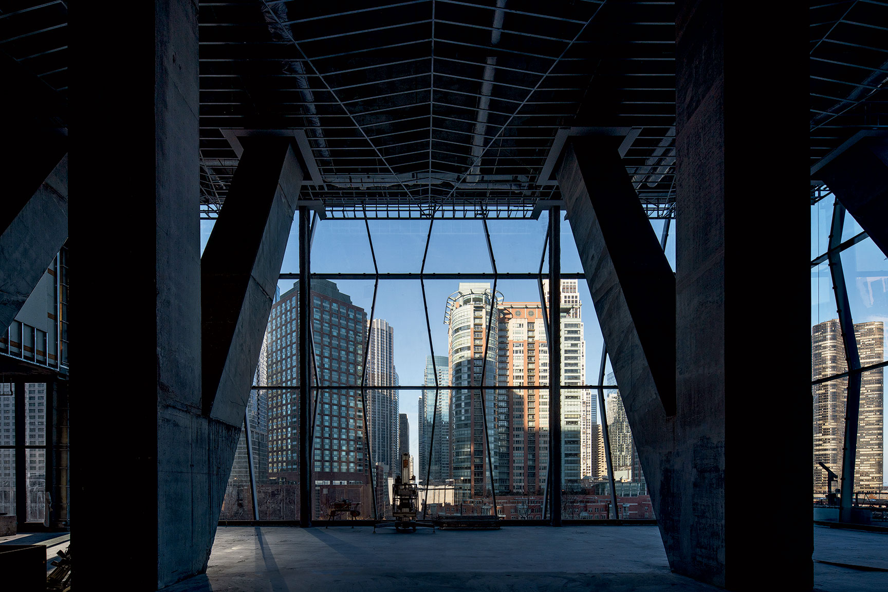
PYRAMIDS …
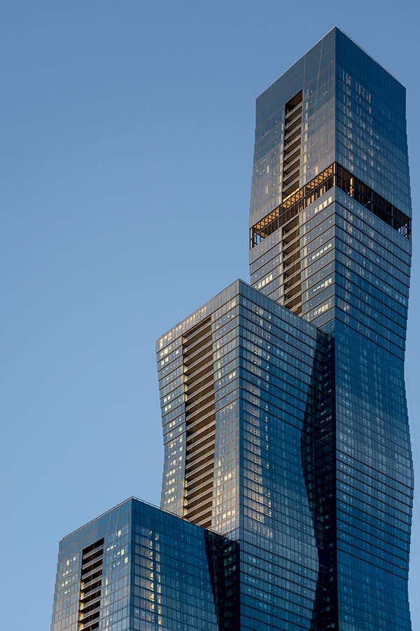
The fundamental building block of Gang’s design is a geometric form called a frustum, which is a pyramid with its top shaved off. You can see it rendered as a visual motif in the window mullions (above) and, more prominently, in the building’s overall form (top of page). “They get stacked on top of each other to make a tower,” says the architect.
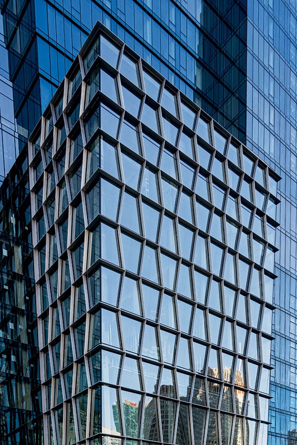
… AND A CUBE
The building’s height may command attention, but one of its most arresting elements is close to the street: a three-story ground-level space that will house a ballroom. (The previous photo was taken from inside it.) “It got nicknamed the Cube,” says Gang. “It’s like in the old hotels, where you would have a very special big room. The idea was to reward someone who comes up closer to the building, and to make it stick out to give great views down the river corridor.”
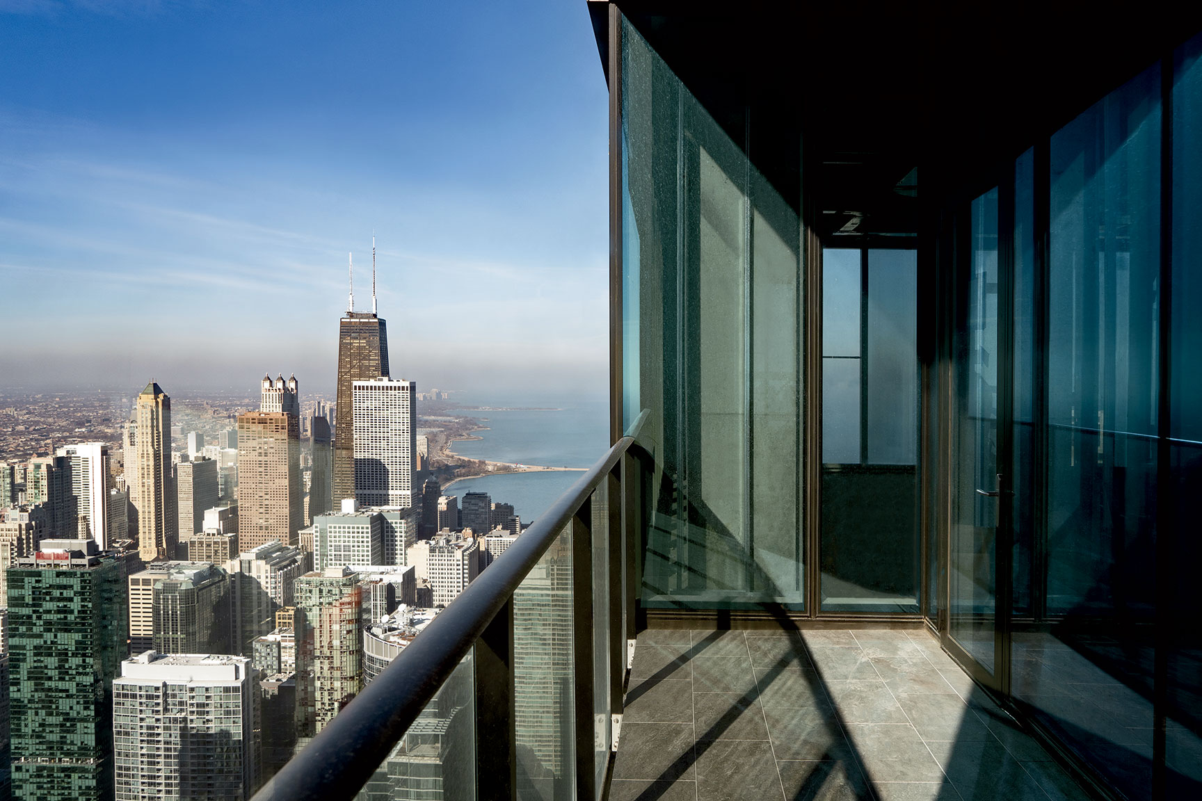
PROTECTED VIEWS
The St. Regis boasts the highest residential balconies in Chicago — topping out at the 91st floor. This one, which offers unobstructed views north and west, belongs to a duplex, occupying the 71st and 72nd floors, that sold in 2018 for an undisclosed sum (asking price: $18.5 million). From the ground, you can barely tell there are balconies at all. “They’re like ‘innie’ balconies instead of ones that are projecting out,” says Gang. “That was a response to the wind.” (The recessed balconies can be seen running up the length of the tower in the photo at top of page.)
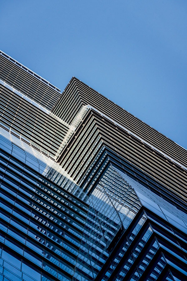
GEOMETRIC RHYTHMS
This view skyward from the ground reveals that the frustums, or truncated pyramids, forming the towers do not line up with each other. “That gives it this dynamic, rhythmic appearance,” Gang says. “But it’s also good for the inside, because you have the benefits of the multiple exposures for the apartments.”
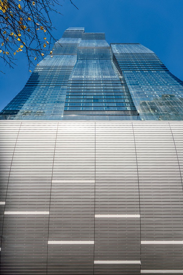
A DRAMATIC PORTAL
This is the view that pedestrians will have if they look straight up before entering the south portal of the passageway under the central tower. The white-paneled curved surface in the foreground swoops upward from the tunnel entrance, reaching the railing of an overlook at the Upper Wacker level.
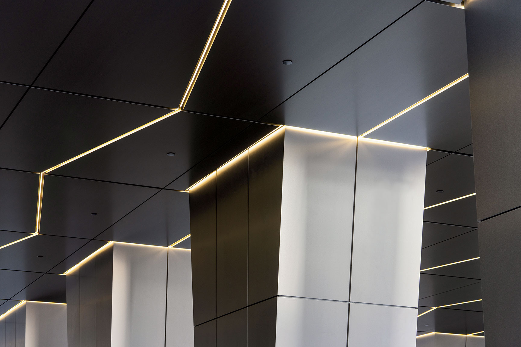
A SLEEK PASSAGEWAY
The interior of the underpass is clad in polished metal panels and illuminated by recessed lighting, creating an inviting space that encourages pedestrians to flow freely from north to south and vice versa underneath the central tower. “The concept of it is, this will be a nice public connection between Lakeshore East Park and the Riverwalk,” says Gang.
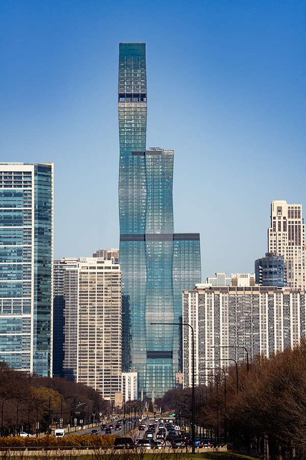
CONTROLLING THE LIGHT
The view up Lake Shore Drive from the south highlights the distinctive reflectivity of the building’s exterior, which is surfaced in six different gradients of custom-coated glass, each designed to keep solar exposure consistent across the building’s undulating facade. As Gang explains it, “When you have the bigger floor plates that are in the center of one of these frustums, you don’t need as much coating on the glass. And then more tint is used as you go toward the narrower part.”
A PHANTOM FLOOR
One of the building’s most visible features is the so-called blow-through floor at the 83rd story, added to minimize swaying caused by high winds. “It’s not a big, fat building that can just overcome [swaying] with stiffness, which is the other tactic you can use,” Gang says. “I’m always in favor of a lighter-touch solution.”


Comments are closed.