Ever since I read Mary Walton's Car: A Drama of the American Workplace—a tremendously undersung book about the making of the 1996 Ford Taurus—I've been fascinated by the making of cars. The book is a great account of the push-and-pull that goes on between engineering and design, ambition and cost concerns, and how high the stakes are in striking those balances.
Or perhaps it dates back to when I was a Hot Wheels-collecting kid and could recognize the make and model of cars, at night, from the reflection of the headlights in the rear-view mirror. This memory hints at one of the goals of the designer: moving forward with the industry while maintaining the visual cohesion of the brand.
We assign a lot of meaning to cars. Hummers, Camrys, and Jaguars all mean vastly different things that, for the most part, we can generally agree on. But what makes a car sensual? Or aggressive? Or sensible? Designers have to make many small decisions, small and large, to create those effects on us, all while dealing with the pressures of money and physics.
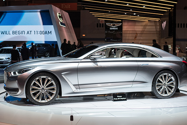
The Chicago Auto Show, which closes this weekend, is my yearly opportunity to get a glimpse into that process. This week I talked to Andre Hudson, a designer for Hyundai, about his job and his work on the company's Vision G coupe, part of its new Genesis line.
Becoming a car designer was an early goal for Hudson. He fell in love with a Dodge in high school, wrote the company to learn how to become a car designer, studied at Detroit's College of Creative Studies (sort of the Juilliard of car design), and went straight to work in the industry, first at GM and then at Hyundai. (He's also one of the few African American car designers in the business.)
The Dodge Viper was the car that made you want to be a designer?
It's the car that inspired me. I remember seeing it in high school and thinking, this thing is amazing. I don't think people realize there's a team of designers and sculptors behind every car they see on the road. I saw this photograph of the clay model of that car with the team standing behind it, and I thought, Wow, that's really cool.
Why do car companies still use the clay models?
I've worked now almost 20 years at General Motors and Hyundai. We've tried at times to go full digital. I myself really like to work [computer-aided design], but there's still something, no matter how much you visualize on a screen, when you see the thing cut out, in real 3D, there's always some surprises. Nothing's quite like you imagine until you see a physical model.
Clay is really the best way to physically see in real time what you're dealing with—what the effect your changes are having on the surface and line. For cars it's the fastest thing to change and alter. Working digitally on a computer, the time it takes to mill that out, print it out, sometimes it's actually faster to work with the sculptor.
You started with this idea of "chivalry." How do you translate that to a visual form?
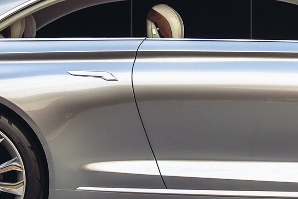
It suggests an intimacy between you and your significant other. One of the key elements that brought that forth was the door handle, that we moved off the door and slid back to the quarter-panel, and we were thinking that, with this large coupe, there's this idea of opening the door and standing out of the way, and the other person gets in the car.

We were thinking, wouldn't it be great if you could stand on the side of this car and, taking your girlfriend or your wife by the hand, stay in full contact with her as you usher her into the seat. Creating this intimate feeling with the use of the car.
A user interface.
A physical user interface, bringing back that intimacy between people.
How did you come up with the diamond-web detailing on the seat?
Some premium vehicles, you'll see this kind of accent and detailing done. We thought we'd reflect some of the detailing that we brought from the outside grill, where you'll see that diamond. It's kind of an abstraction of the Genesis wing logo, brought into the detailing on the seats.

Another thing that struck me were the side mirrors. What design decisions went into that?
We looked at the Genesis badge itself, with wings—it's an abstraction of wings. We repeated that motif in a more three-dimensional form throughout the car. If you notice the grill itself, each little element is actually a winged Genesis badge. Do you see the winged shaped within the form? If you put the two wing mirrors together, you see a repeat of the winged element.

What would the casual car buyer maybe not notice about the proportions?
A lot of the luxury big cars from the ’30s had this beautiful air, of a nose-up feature line coming back, the belt line and the DLO kind of dropping as you go rearward. Very often these cars had this beautiful chrome garnish that actually dropped back over the rear wheel. If you look at the Duesenberg, classic cars from the '30s, these were all key elements in these luxury coupes.
Somewhat subliminally in this car, if you look at the structure of the little vertical surface below the mirror, you'll see it stretch from this fine detail in the hood and as the car comes around, you'll notice that behind the rear wheel, you'll notice that the structure drops back.

That detail, without being an actual chrome piece, that shadow and the highlights create that same type of gesture of these classic luxury cars from many, many decades ago. It gives the car a flagship, premium gesture. You get this much more proud gesture. Nose up, easing back. When you look at the structure of that feature, it's a beautiful, classic architecture, and everything hangs off of that.

Yet on the front, the distinctive Hyundai front is there.
If you look at a lot of premium marks today, the big flagship cars, you'll see that the graphics are really low and wide. And we wanted to keep a bit of that central fluidic sculpture that Hyundai is known for. Even though the grill is kind of proud and low, the lights themselves kind of sweep back, unique in cars of this size.
Some of the detailing, if you walk around the front, if you think about air management, even though this is a large car with a large motor, we thought about how we could use some aero elements to make it a bit more efficient. The front garnish with the vertical graphics and the aluminum are actually an air curtain to direct air into the wheel opening, and the graphic behind the wheel is an air curtain as well, to allow the air pressure that's built up in the wheel openings to exit. We've chosen to take some of the aero and air-management elements and make it part of the design.

A few years ago, you said that cars had gotten too "architectural" and "tectonic." What did you mean?
They felt too stiff. The trend was that they felt like they were coming right out of the computer. The trend now is getting back to a much more sculptural, three-dimensional feeling. Bringing back some of the romantic elements of cars.
I get some aggressiveness from the front.
With the premium luxury cars, you want it to feel proud, strong. With the Genesis brand we wanted it to feel somewhat sensual. One of the key elements with Hyundai has been the lamps the last several years. We've had these very gestural lamps. As we moved into developing this show car and the G90 in production, the kind of gentle scowl and the shape of the headlamp—you said aggressive, I'd say assertive. This idea that I'm moving down the road, I have a certain stature and feeling, and I want to have a presence. All these things come to mind when you're thinking about the lines and the sculpture.


