The Illinois State Flag Commission has come out with 10 finalists — chosen from nearly 5,000 submissions — for a new Illinois state flag. Voting has begun, and folks can choose from one of the new designs, the centennial flag (adopted in 1918), the sesquicentennial flag from 1968, or the current boring design this entire exercise was designed to remove from flagpoles. Once the voting is complete, in April, the 20-member Illinois Flag Commission will recommend a candidate to the legislature, which will make the final decision. We don’t want to tell you how to vote, but we ranked the 13 contenders, based on how well they achieve the state’s goal of a flag that will “better represent the state’s diversity of urban, suburban and rural communities and inspire renewed pride among Illinoisans.”
No. 13
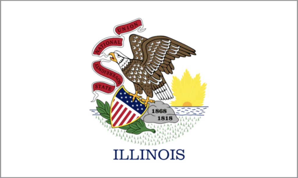
The current flag. The whole point of this exercise is getting rid of this boring “seal on a bedsheet” design.
No. 12

The Centennial Flag, created in 1918 to commemorate a century of Illinois statehood. A white star on a blue stripe, flanked by ten stars on each side, for a total of 21. It’s colorless and dull.
No. 11
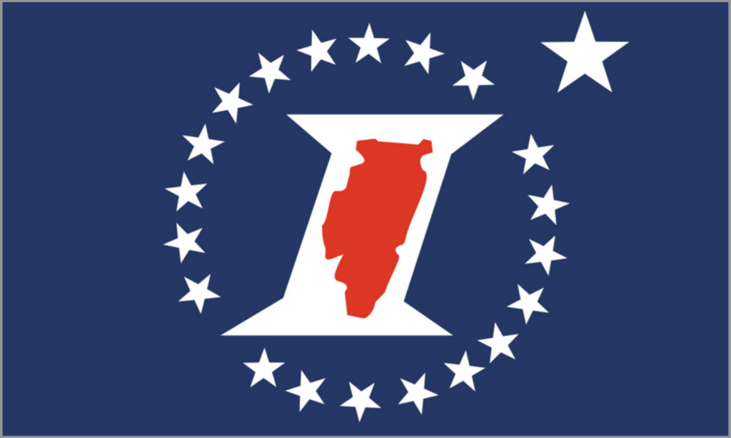
The Sesquicentennial Flag, with a red silhouette of the state embedded in a white letter I. Looks too much like the symbol of the Illinois Department of Transportation.
No. 10
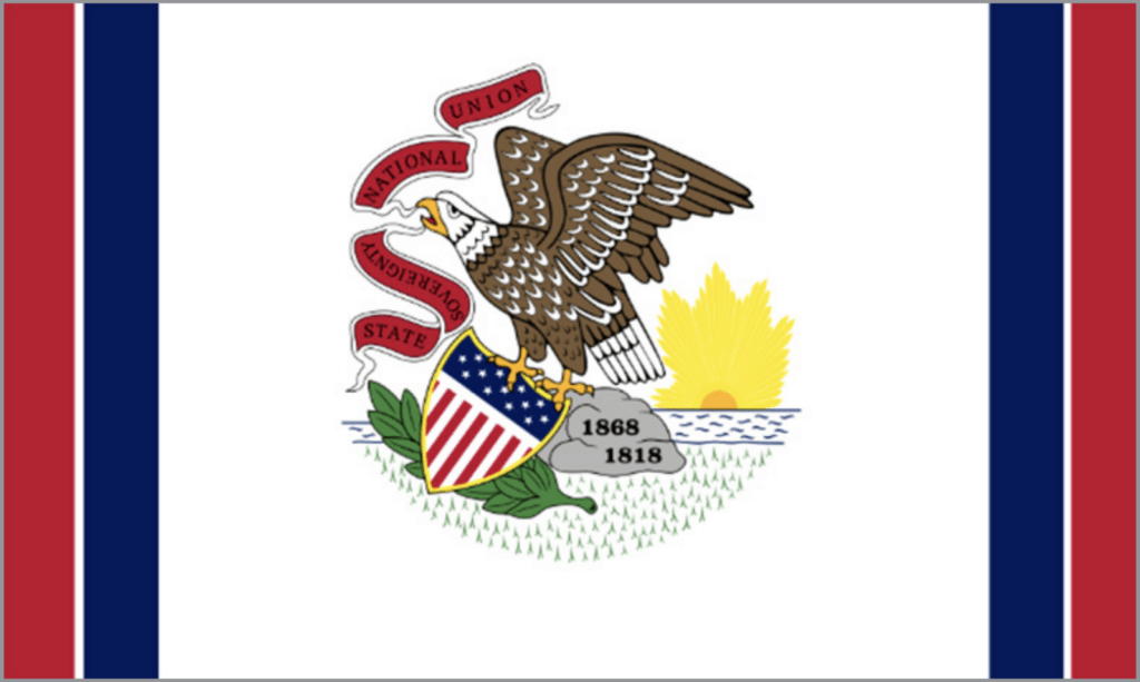
The current state flag, with blue and red stripes on either end and the word “ILLINOIS” omitted. Aren’t we trying to get rid of this random collection of clip art?
No. 9
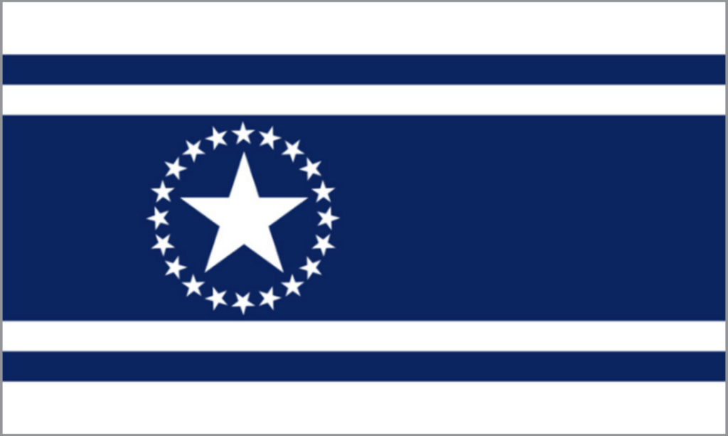
A large white star surrounded by 21 smaller white stars. A thick blue stripe to represent Lake Michigan with smaller blue stripes for the Illinois and Mississippi rivers. Thoroughly generic.
No. 8

A six-pointed gold star embedded in a blue circle, which is Abe Lincoln’s stovepipe hat. A thick blue bar represents Lake Michigan. This looks more like the flag of a random developing nation than a flag of Illinois. Illinoisistan?
No. 7

This looks like an Oriental design, but the flower in the middle is meant to represent a corn kernel, for agriculture, set atop of a 21-toothed gear, for industry. The four blue bars represent Lake Michigan, the Mississippi River, the Ohio River and the Chicago/Illinois River system. Nothing about this screams Illinois, though. Or even whispers it.
No. 6
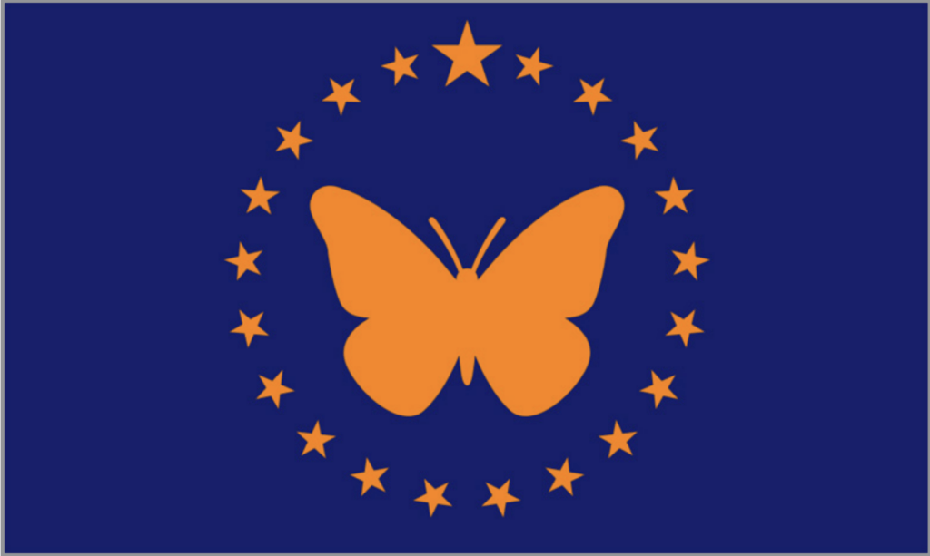
The monarch butterfly is the official butterfly of Illinois. That’s not a well-known fact, but this flag comes in the blue and orange colors of the University of Illinois, and the butterfly is ringed with 21 stars. Do we really want to be represented by a butterfly?
No. 5
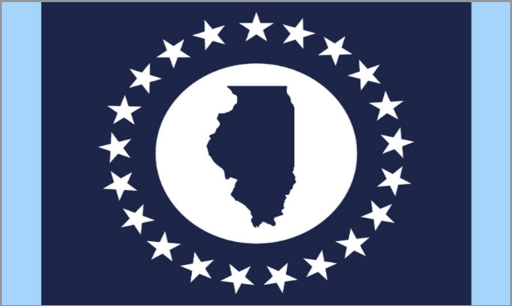
An outline of Illinois within a circle, to suggest the state’s central location as “a hub for train and air traffic.” The light blue stripes on either edge represent Lake Michigan and the Mississippi River. Yet nothing about it really suggests Illinois, so how can we expect the public to decipher it?
No. 4
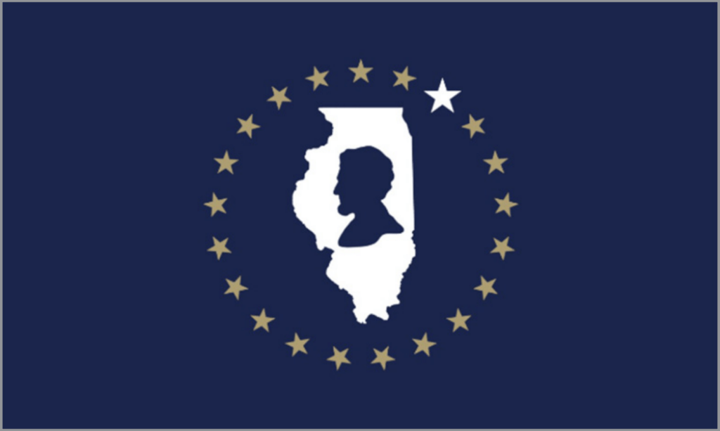
A silhouette of Lincoln embedded in a silhouette of Illinois, surrounded by 21 stars. How could this flag represent any state but Illinois? It’s not especially colorful, though, meaning it won’t stand out among the traditional seal-on-a-bedsheet flags.
No. 3

This one looks a little cartoonish, with thick green stripes to represent the farmland of Illinois, a yolk-yellow sun, and six-sided stars to represent Northern, Central, and Southern Illinois. But then, how many states have cartoonish flags? This one will, at the very least, stand out for its modernistic design.
No. 2

The red, white, and blue stands both for Old Glory and the tricolor of France, which also flew over the state. Lincoln’s profile and the state’s Mississippi River boundary face off nicely against each other — but they may be hard to identify from the top of a flagpole, knocking this option out of the top spot.
No. 1

An American flag in miniature. The 21 stripes represent Illinois’s admission as the 21st state. The six-pointed star on a blue field represents Chicago, and the white space in between is shaped like a letter “I”, so everyone will know it’s us. A perfect combination of Americana and Illinoisana.


